SCROLIS — UC BERKELEY MIMS CAPSTONE 2026
Replacing the infinite scroll with a daily digest worth finishing.
A mobile app that turns your timeline into a bounded, perspective-aware digest — balanced, finite, and free from the algorithm.
My Role
Product Manager
Team
5 people (1 Designer, 1 Full-Stack, 2 Data/ML)
Timeline
6 months (January – May 2026)
Tools
Figma, React Native, BERTopic/NLP, OpenAI/Claude, X/Reddit APIs
A QUICK LOOK
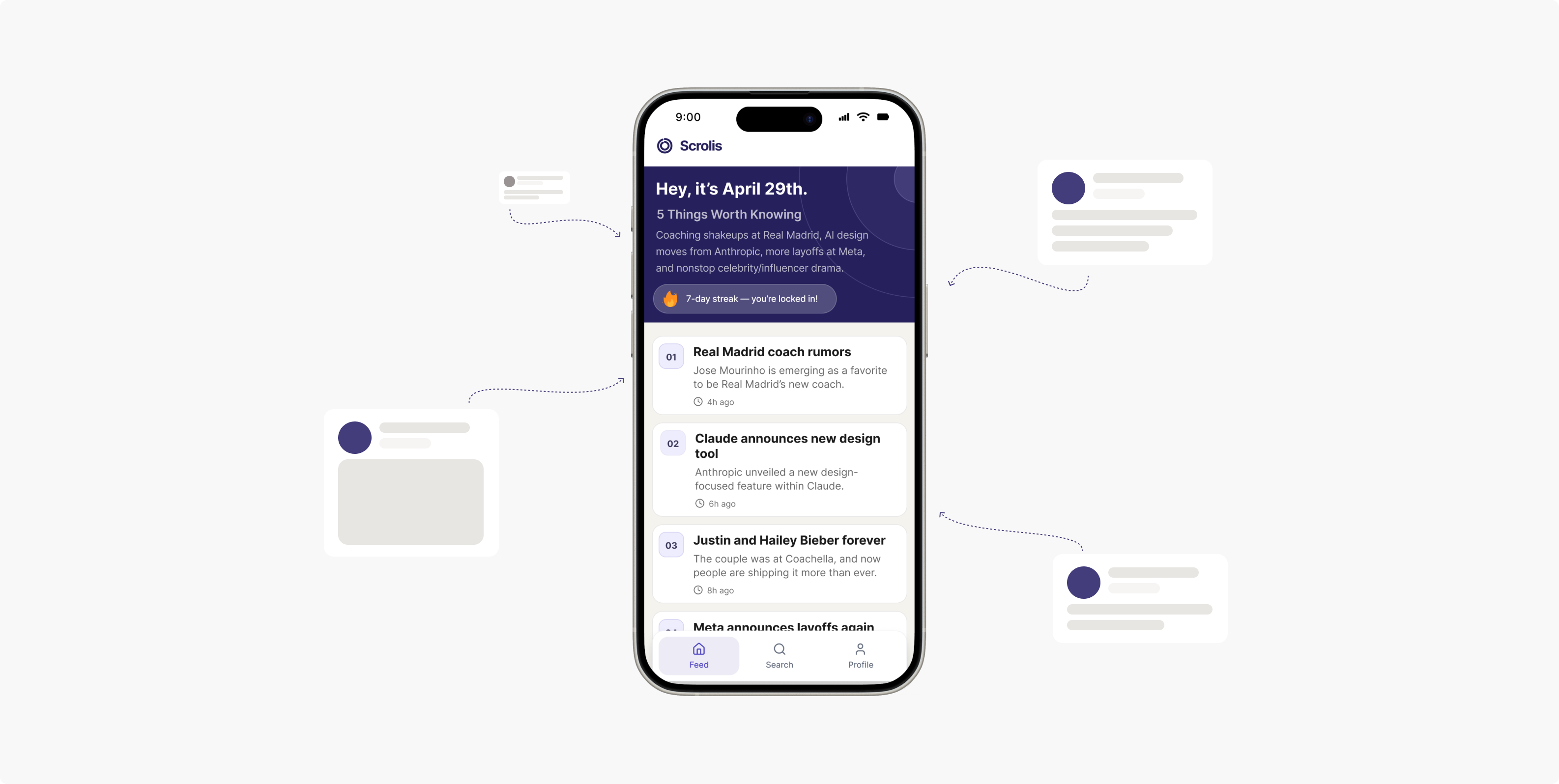
Scroll less. See more.
For our MIMS capstone, my team built Scrolis — a mobile app that replaces algorithmic doomscrolling with a finite, curated daily digest. Each day you get up to five topics pulled from accounts you already follow, organized by theme, and enriched with perspectives outside your usual bubble. When you reach the end, the feed ends. No algorithm pulling you back in.
As PM, I led product strategy, user research, and two rounds of vibe-coded prototype testing that shaped our core design decisions. I also co-authored the PRD and managed scope across a team spanning product, design, full-stack, and ML.
THE PROBLEM
We scroll for hours and feel less informed.
Social media platforms are engineered to maximize time-on-platform, not informational value. The result is a reinforcing loop: algorithmic feeds surface what you already agree with, sessions end from exhaustion rather than satisfaction, and users gradually lose awareness of how much they aren't seeing.
100%
of our interview participants said they stop scrolling from exhaustion — never because they feel finished
14
participants across two rounds of vibe-coded prototype testing
2
core problems: infinite scroll driving overload, and echo chambers narrowing perspective without users noticing
“I feel pretty drained after… I wasn't going in with a specific goal. Once I eventually close the app, I feel pretty unfulfilled.”
“None of the content I see really disagrees with my core beliefs. It tends to just reinforce them.”
Screen time apps address how long you scroll. News aggregators address what you read. Neither addresses whether you're getting a complete picture. Scrolis was built for that gap.
THE PROCESS
Two rounds of prototype testing before we built anything real.
We used vibe-coding as a research methodology — rapidly scaffolding lo-fi prototypes to test features in isolation before committing to any design direction.
- 1
User interviews — Seven semi-structured interviews with heavy social media users (22–29), covering overload, echo chamber awareness, and coping strategies.
- 2
Feature-level testing (Iteration 1) — Isolated four features: content validation, echo chamber awareness, topic clustering, and finite digest. Key signal: users want ambient structure, not scores or surveillance.
- 3
Prototype consolidation (Iteration 2) — Collapsed strongest features into two unified prototypes. Insights embedded inside the content experience landed; abstract dashboards on the home screen created confusion before value could land.
- 4
Final usability testing — Six participants across onboarding, home feed, and the three perspective tabs on a single topic.
THE FINAL PRODUCT
A digest you can actually finish.
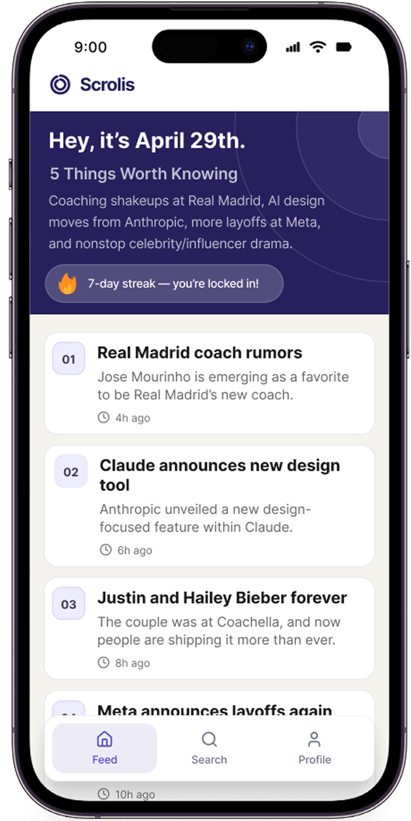
Every design decision in Scrolis is downstream of one principle: calm as a feature. The home screen opens on a date-anchored digest of five curated topics — numbered, scannable, and completable. When you've read them, the feed ends.
THE APP
THE PERSPECTIVES
UNDER THE HOOD
How three steps turn your timeline into a balanced digest.
The pipeline runs nightly, pulling from connected X/Twitter and Reddit accounts and transforming raw posts into structured, LLM-summarized topic clusters.
Step 1 — Building “For You”
Your Account
X / Twitter · Reddit
Your Feed
Gathered via API
≤200 posts/source
Topic Clustering
BERTopic
Top 5 topics
LLM Summary
OpenAI / Claude
Headline + take
TAB · BASELINE
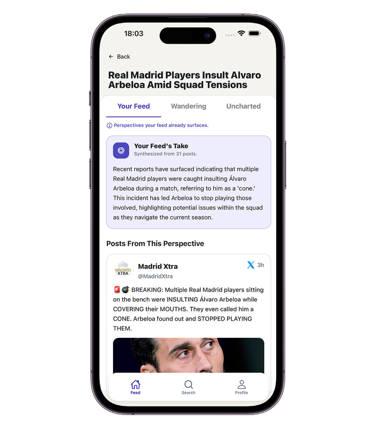
For You
your feed's take
Posts from your connected accounts are fetched via OAuth, cleaned and clustered by BERTopic into the top five topics, then summarized by an LLM into a headline and a synthesized “take.” This powers the For You tab.
Steps 2 & 3 — Breaking the Echo Chamber
TAB · BASELINE
For You
topics + keywords
ECHO-BREAKING
Search Queries
5 stance variants/topic · critical · emotional · neutral…
DIVERSITY FILTER
Score & Split
relevance + divergence + recency → threshold
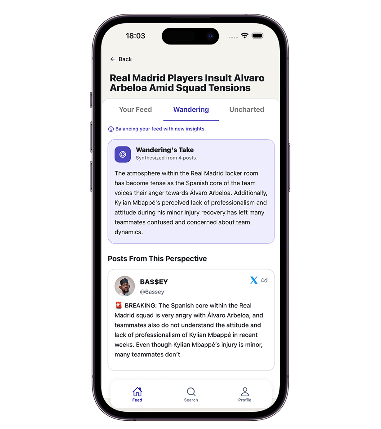
TAB · ADJACENT
Wandering
TAB · OUTSIDE
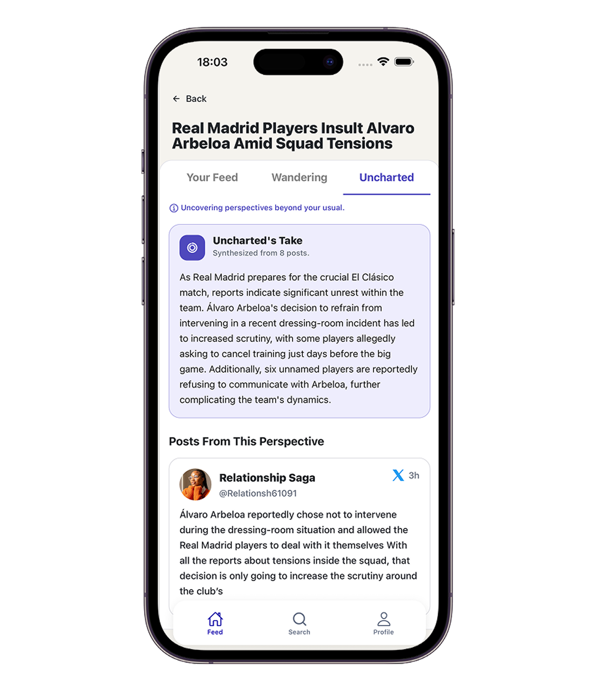
Uncharted
The echo-breaking layer uses the For You topics to generate five stance-based search queries per topic — critical, emotional, supportive, neutral, and industry-oriented — then fetches posts from outside your follow graph. A diversity scorer weighing relevance, divergence, and recency splits results: higher-divergence posts go to Uncharted, moderate-divergence to Wandering, which is re-run through Step 1's clustering and summarization pipeline.
Storage: PostgreSQL handles structured user and auth data. MongoDB stores the daily topic digests, historical archives, activity logs, and topic preferences — all the dynamic analytical data that powers the feed and profile screens.
USABILITY TESTING — KEY FINDINGS
What landed, and what still needs work.
✓ What worked
- ✓Finite structure felt real — users treated the digest like a checklist
- ✓Uncharted was the standout tab: expanded awareness without feeling pushy
- ✓Participants articulated Scrolis's value unprompted, in their own words
- ✓"We only read, never post" — the onboarding transparency signal built immediate trust
✗ What didn't
- ✗"Wandering" confused nearly every participant — the label didn't communicate a clear promise
- ✗Topic summaries and topic cards repeated the same information twice
- ✗Every outbound link was a potential exit — cross-platform friction disrupted flow
- ✗Streak counter added anxiety for some users in an otherwise calmer experience
IMPACT & RETROSPECTIVE
What I'd carry forward.
On product strategy
The hardest calls weren't feature decisions — they were scope decisions. Choosing not to build the analytics dashboard, based on research signal that abstract metrics added friction, was one of the most important things we did.
On PM in a research context
Vibe-coding as a research method genuinely changed how fast we could move. Putting something interactive in front of users on day two of a sprint — not wireframes, not decks — gave us qualitatively richer signal.
On the echo chamber problem
Usability testing taught me that the goal isn't to change users' minds — it's to make visible what they're missing. Participants didn't shift positions; they became more aware. That's the right bar for a product like this.
What I'd do differently
Recruit outside our immediate networks earlier. Every participant shared a similar educational background, which likely suppressed friction points we'd see in the broader Mindful Scroller population.
Next Project